
This project was completed for the Intermediate Visual Communication Design 2 Course and was completed as a group with Brianna Gallagher and Mariam Baig. The goal of this project was to create a visually pleasing package design that focused on the presentation of the information. We chose to use the already existing brand Native, and create a concept design for a curly hair shampoo and conditioner bundle. We used Adobe Illustrator and Miro to complete this project
Team Member Roles: Each team member helped with collecting visual inspiration, ideation, research of the current brand, creating presentations, and the creation of the final deliverables.
Mekayla: Research of the current Native branding, box design, and the construction of the final box deliverable.
Mariam: Brand color scheme, graphics used for all 3 deliverables, and the construction of the final conditioner deliverable.
Brianna: Research on materials, directions, creating the icons, designing the layout of the bottles, and the construction of the final shampoo deliverable.
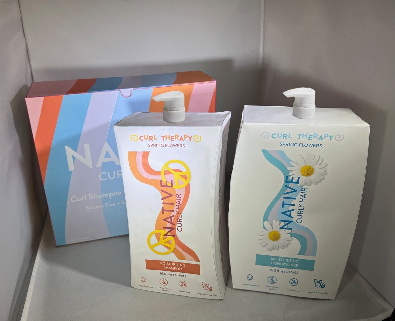
Full Set Of Final Deliverables
Process
When we started the project we decided that we wanted to create a package that was either makeup or hair related. We started by looking at different types of preexisting packagings and how they displayed the different types of important information on them.

Screenshot of our mood board, images came from Pinterest.
During the Ideation stage we came up with two concepts to present to the class for feedback. One was the shampoo and conditioner bundle, and the other was a stackable skincare package. After receiving feedback, we decided to go with the shampoo and conditioner bundle.


After determining which path we were going to follow, we starting taking note of what information we were going to need to portray on the packaging. We were originally going to create our own branding, but for the sake of time and research we decided to use Native’s branding. This allowed us to use their preexisting ingredients and focus on creating a package for them that was unique and portrayed the ingredients and instructions in a clear way. We felt that Native already did a good job of clearly stating which ingredients were in their products and what they were used for. We wanted to keep this feature as it is important to the company to be as clear as possible, but we wanted to make it even more clear by adding a visual to each ingredient.
During class Brianna and Mekayla focused on created prototypes of the bottles and bag (which would later turn into a box due to materials and printing.) Mariam focused on creating the visuals that would be used on both bottles and the bag to make everything appear as one package. Once the visuals were created and we had determined at a small scale how the prototypes would work, we were able to add the visuals to our templates in Illustrator and start determining how we wanted to organize the information.


Brianna’s prototypes of the bottles.

Mekayla’s prototype of a bag, which would later be turned into a box.

After we created our prototypes we made the layouts of the bottles, the icons, and the layout of the bag.
For the final critique day we created full scale prototypes of both of the bottles and the bag to determine what was working and what final changes we needed to make. It was at this stage that we determined that the bag concept did not work as planned at full scale and that a box would work better.

First full scale prototypes

Full scale version of the bag and the layout of the new box template. The text did not lay out as planned on the bag and we realized there was too much material being used where a box would eliminate the need for extra wasted material.
Final Deliverables

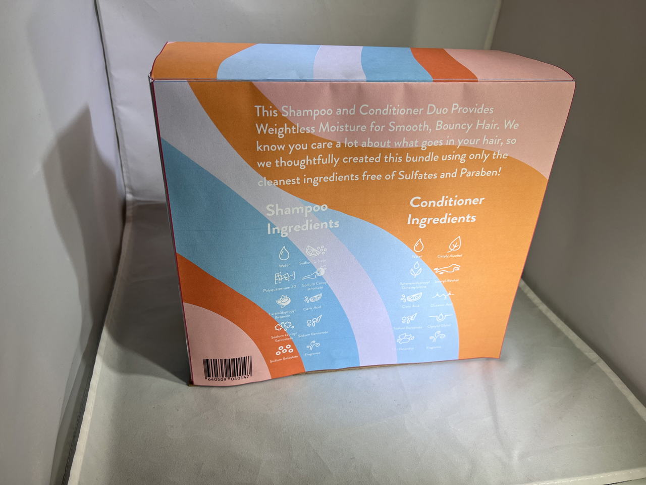

Final Box. Native branding on the front describing the fact that the products inside are a curly hair shampoo and conditioner bundle. Information on the back has the description of the product and all of the ingredients listed.


Final Deliverables of both the shampoo and conditioner containers. The Native Branding is present on the front, while including information about the scent, what is missing from the product, such as parabens, and different color pallets to help the consumer quickly distinguish the difference between the bottles in the shower. On the back we included the steps on how to use the products. The ingredients are listed on the sides of both of the packages. The shape of the containers was intentional because we wanted them to be able to fit together in the shower so the consumer could stack them.